Create a Custom Input Range Slider for Consistency Across Browsers

I am a Frontend Engineer and a Creative Developer. I love learning and sharing my journey to inspire others.
Introduction
The range slider is an HTML input type that displays a slider for values between a given maximum and minimum value. However, its default display is inconsistent across different browsers. In this article, we will discuss how to create a custom input range slider with HTML, CSS, and a little JavaScript, that looks the same on all browsers.
Prerequisites
To get the most out of this article, you will need to know some basic HTML, CSS, and JavaScript including how to create forms. If you have no knowledge of these languages, you can check out my article on getting started with HTML and CSS and the transition to JavaScript.
Anatomy of the range slider
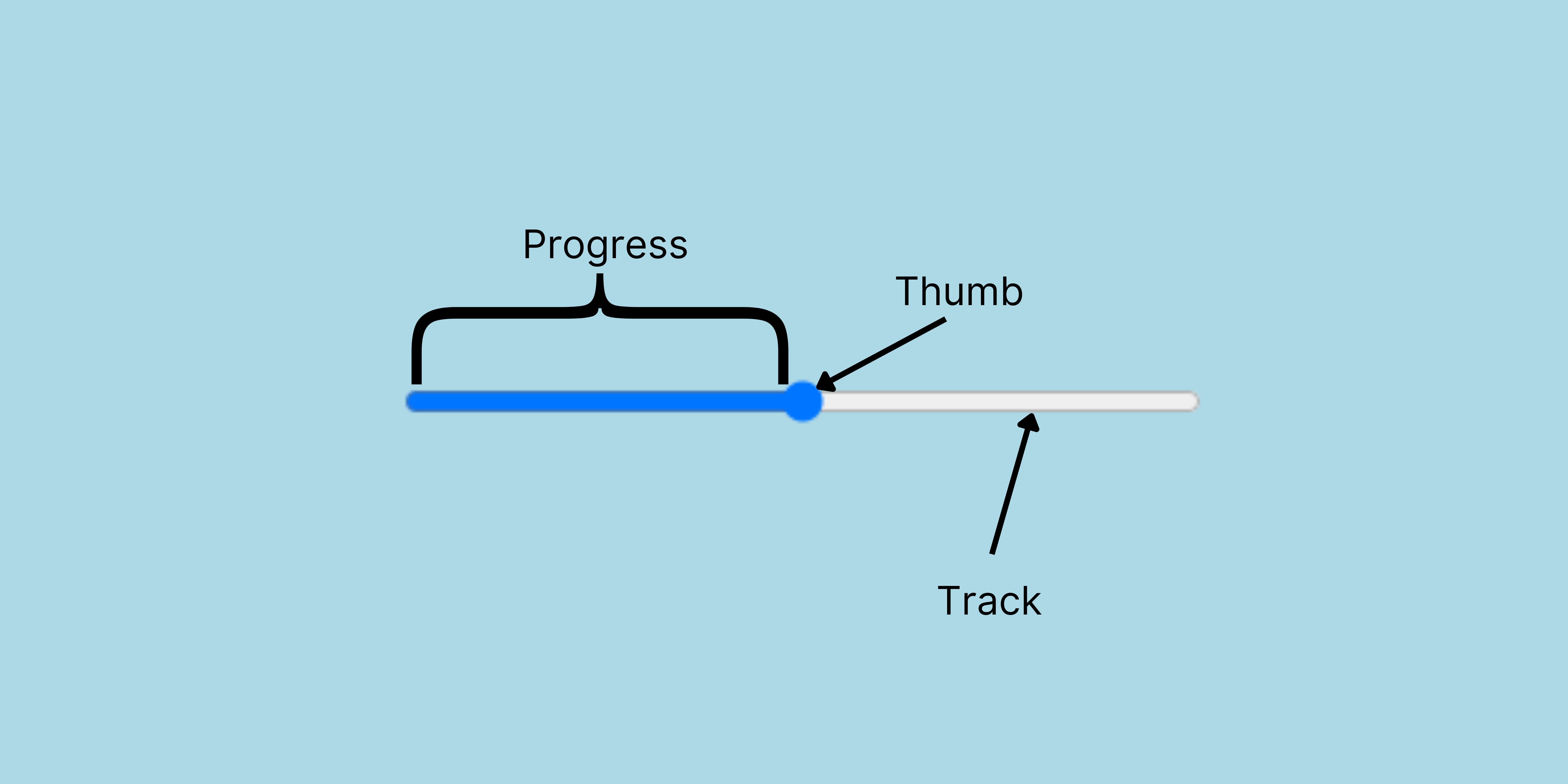
The input range has two main parts. The thumb and the track. To make your own custom range slider, you will need to target these two parts in CSS and style them. Another part is the progress, which will also be styled by CSS and updated with JavaScript.
Why a custom range matters
These are the default displays of the input range on the various popular browsers.
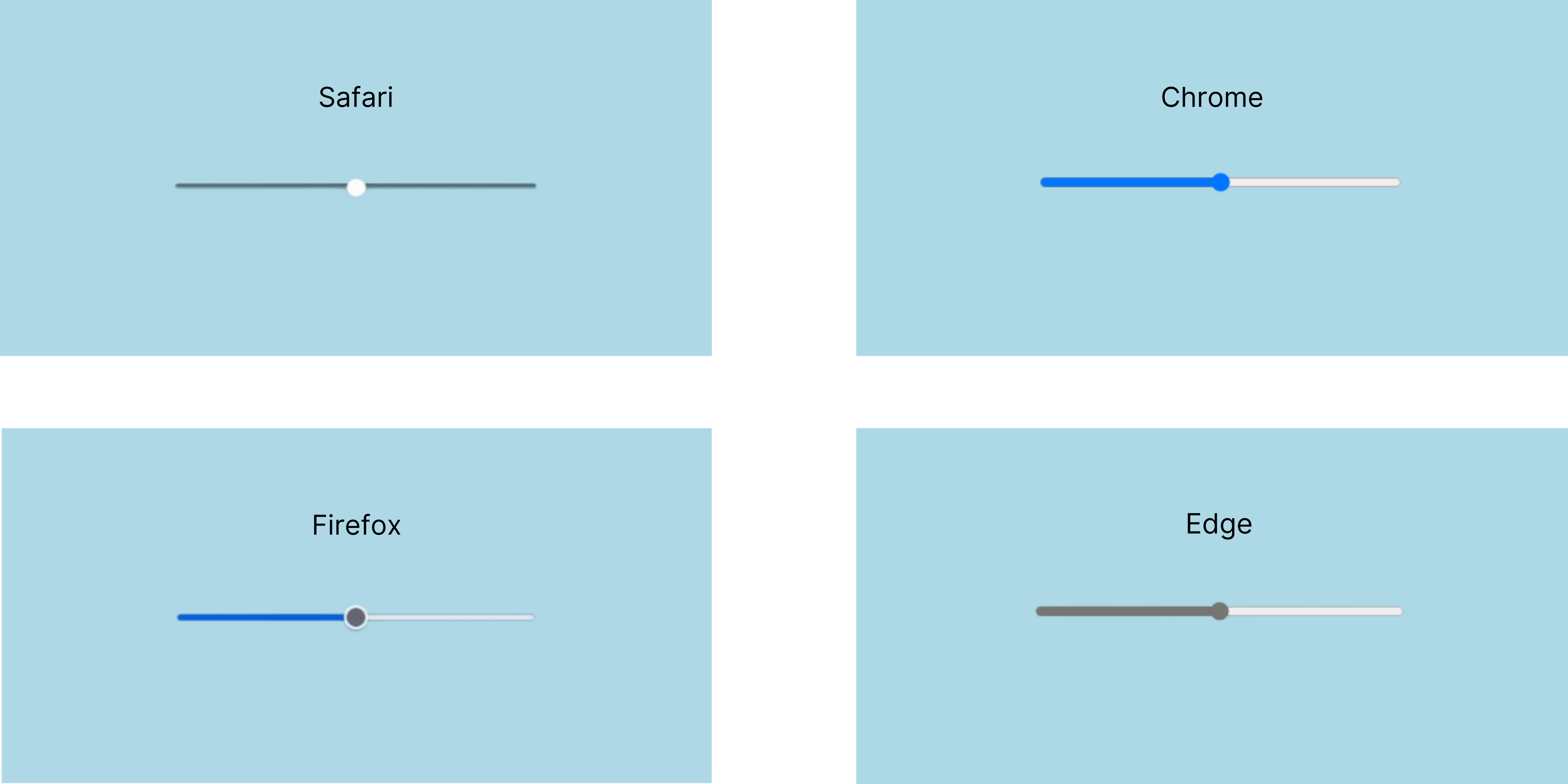
Need I say more? 😂
Having a custom range input styled to your preference is important because it allows you to maintain a consistent look and feel for your website across different browsers.
How to style the range slider
We are going to start with a simple HTML code to define the structure.
First, we create a div that will contain the slider and an output. The output will display the slider value. We will then give the input range a minimum value of 0, a maximum value of 20, and a default value of 10.
We then set the value of the output to 10 in the output element as well since our default input value is 10.
<div class="range-container">
    <input type="range" name="range" id="range" value="10" min="0" max="20">
    <output type="number" id="output" class="output">10</output>
</div>
Next, we want to sync the output value with the input value so that the output updates as the user slides the thumb. To do this, we will use an inline JavaScript code.
Now we call an oninput event listener inline on the input element and update the output value with the input value.
<div class="range-container">
    <input type="range" name="range" id="range" value="10" min="0" max="20" oninput="output.value = this.value">
    <output type="number" id="output" class="output">10</output>
</div>
This GIF shows what we have now, in Chrome (that is my default browser). The output updates as we slide through values.

This will be all for our HTML, now let us move to CSS for the magic!
Removing browser defaults
To implement custom styles for an input range slider, we need to remove the default browser styles. This requires the use of vendor prefixes along with other CSS styles.
We will use the attribute selector input[type="range"] to apply the styles that will allow us to have a blank slate.
input[type="range"] {
    -webkit-appearance: none;
    background: none;
}
The code above will leave us with the thumb and the output value:

The thumb is left after the reset we made because it needs to be targeted with a pseudo-element which we will look at shortly.
Styling the track
To style the track, we will add our preferred background color, height, and border-radius to our previous code:
input[type=”range”] {
    -webkit-appearance: none;
    background: #273549;
    height: 5px;
    border-radius: 50px;
}
Here's what we have now:

Now our track looks good. Let’s reset our thumb and add our preferred styles.
Styling the thumb
We will target our thumb with the pseudo-elements: input[type="range"]::-webkit-slider-thumb for Chrome, Safari, and Edge, and then input[type="range"]::-moz-range-thumb for Firefox.
/* Chrome, Safari, Edge */
input[type="range"]::-webkit-slider-thumb {
    -webkit-appearance: none; /* clear browser thumb */
    width: 15px;
    height: 15px;
    background-color: #6d8788 ;
    border-radius: 50%;
}

/* Firefox */
input[type="range"]::-moz-range-thumb {
    -webkit-appearance: none; /* clear browser thumb */
    width: 15px;
    height: 15px;
    background-color: #6d8788 ;
    border: none;
    border-radius: 50%;
}
Here's what we have now:

Congrats! You have created a custom input range slider that will look the same across all browsers. However, if you want to take it up a notch, you can style your own progress. Keep reading to find out how :)
Styling the progress
To style the progress, we will use both CSS and JavaScript. We will need to go back to our first code, the one with the browser resets, and add a linear gradient with our preferred color. We will then set a background size and remove background repeats so that it covers part of the track that we want.
input[type="range"] {
    -webkit-appearance: none;
    background: #273549;
    height: 5px;
    border-radius: 50px;
    background-image: linear-gradient(#7DD3FC, #7DD3FC);
    background-size: 50% 100%;
    background-repeat: no-repeat;
}
In CSS, the background-size property has two values: the width and the height, in that order. We have our height set to 100% because we want our progress color to fill the full height of our slider. The width is set to 50% because our default value is 10, which is 50% of our maximum value, 20.
So for example, if we have a default value of 5, our width will be set to 25% because 5 is 25% of our maximum value, 20.
This is the logic we will use in our JavaScript. We will update the width value of the background-size as the user moves the thumb on the slider.
Our slider looks like this currently:

Now let’s fix the broken progress with JavaScript. We will grab the input element from HTML by its id and add an event listener that will handle the progress change.
const range = document.querySelector("#range")

range.addEventListener("input", () => {

    const min = range.min
    const max = range.max
    const currentVal = range.value

    range.style.backgroundSize = ((currentVal - min) / (max - min)) * 100 + "% 100%"
} )
In the formula, we are dividing the difference between our current value and minimum value by the difference between our maximum value and minimum value. We then multiply the result by 100 to get the width percentage. Finally, we add the result to the string “% 100%” to get a background-size value.
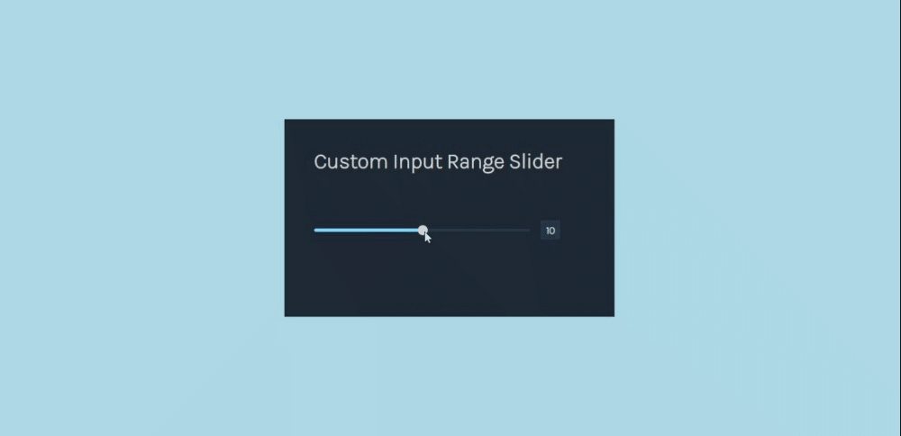
Now our custom input range is ready! I added a heading and a few styles to make it pop :)
You can find the repo with all the code here and view the demo on this site.
Conclusion
Creating a custom range slider ensures that your slider looks the same across all browsers. In this article, we discussed what an input range slider is, its anatomy, why it is important to make a custom one, and how to make your own using HTML, CSS, and JavaScript.
Thanks for reading!


